A React library for Y-M-D dropdown date picker
I created react-ymd-date-select, a React library for Year, Month, and Day dropdown UI.
whitphx/react-ymd-date-select - GitHub
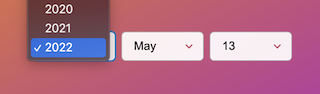
We sometimes need Y-M-D dropdown UI like the screenshot above rather than calendar UI. For example, when asking users to select their birth dates, Y-M-D dropdown is preferable because calendar widgets are usually difficult to seek to far old years, and conversely, its benefits such as intuitively showing days-of-week are not needed.
I actually encountered such a situation, however, I could not find any existing packages that meet my needs. In turn, building it by myself looks simple, but actually, there are some nuts as below.
- Generating the arrays of year, month, and day numbers and labels.
- Validating the combination of Y-M-D. For example,
2022-02-29(Feb 29, 2022) is an invalid combination - that date does not exist. - Combining the 3 values from Y, M, D
<select >s into one date string, and integrating it with the form component state or form library, e.g. React Hook Form throughvalueandonChangeprops.
And sometimes there come more requirements like
- To set the default year.
- To show only year and month selects (hide the day dropdown).
So, to handle these, I made a library react-ymd-date-select.
With the useDateSelect() hook provided by this library, you can create original Y-M-D components like the sample below, focusing on the view behavior as cumbersome logic has been encapsulated into the hook.
The value prop and the argument of onChange() are string formatted in yyyy-MM-DD, which is ISO8601 format, and the same as the value of the native <input type="date" />. See https://developer.mozilla.org/en-US/docs/Web/HTML/Element/input/date#value
See the demo page for more information.
import { useState } from "react";
import { useDateSelect } from "react-ymd-date-select";

interface CustomDateSelectProps {
  onChange: (value: string) => void;
  value: string;
}
function CustomDateSelect(props: CustomDateSelectProps) {
  const dateSelect = useDateSelect(props.value, props.onChange);

  return (
    <>
      <input
        type="date"
        value={dateSelect.dateValue || ""}
        onChange={dateSelect.onDateChange}
      />
      <label>
        Year
        <select value={dateSelect.yearValue} onChange={dateSelect.onYearChange}>
          {dateSelect.yearOptions.map((yearOption) => (
            <option key={yearOption.value} value={yearOption.value}>
              {yearOption.label}
            </option>
          ))}
        </select>
      </label>
      <label>
        Month
        <select
          value={dateSelect.monthValue}
          onChange={dateSelect.onMonthChange}
        >
          {dateSelect.monthOptions.map((monthOption) => (
            <option key={monthOption.value} value={monthOption.value}>
              {monthOption.label}
            </option>
          ))}
        </select>
      </label>
      <label>
        Day
        <select value={dateSelect.dayValue} onChange={dateSelect.onDayChange}>
          {dateSelect.dayOptions.map((dayOption) => (
            <option key={dayOption.value} value={dayOption.value}>
              {dayOption.label}
            </option>
          ))}
        </select>
      </label>
    </>
  );
}